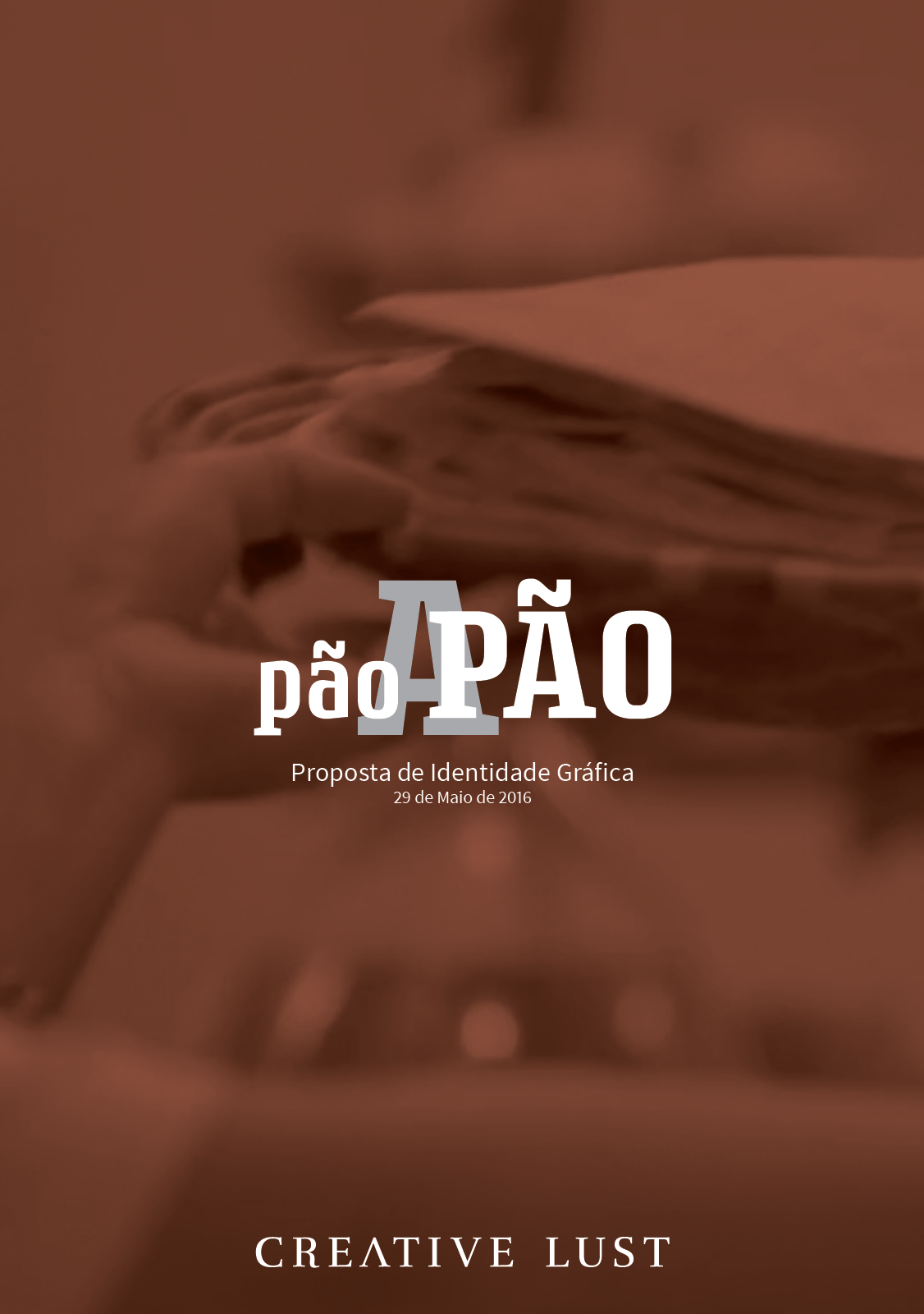
pão a Pão
Branding, Graphic Design, Creative Direction,
Brand identity for refugee support initiative
Pão a Pão is a project for helping the integration of Syrian refugees in the Portugal, through the creation of a community kitchen where both Portuguese and Syrian people are welcome.
As is often the case with these projects, they reached out to us and we agreed to design the wordmark and general tone of the brand.
The wordmark was set in Rogue Serif, by Device Fonts.
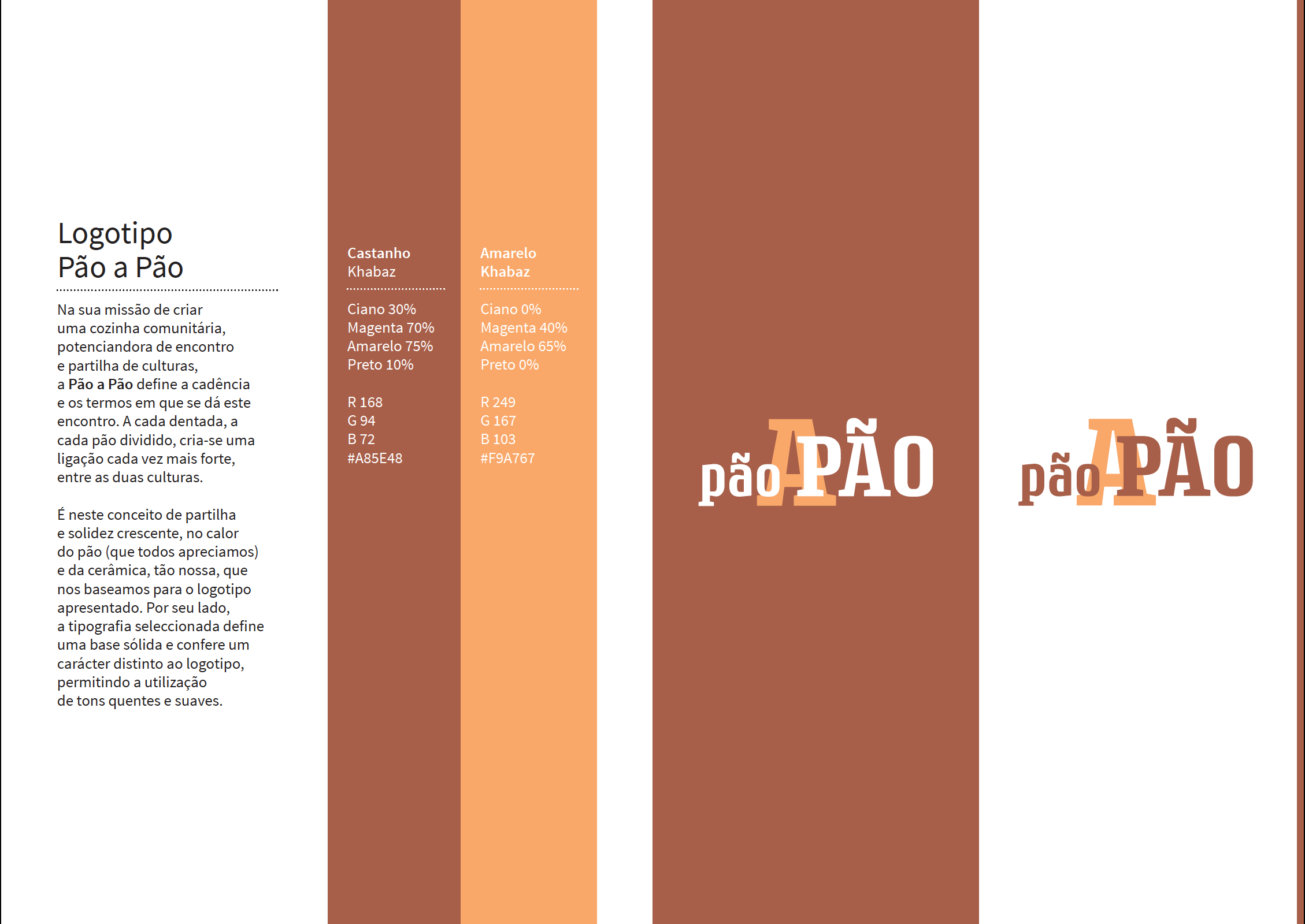
Brand guidelines and explanation.

Poster for show cooking and Syrian food tasting.